And know this is not the "final" final, because once we have lights and the eating area is painted a nice slate grey/blue/who knows what color it will actually look like because I just picked the paint on a whim, we will take official finished pictures. And probably giggle with joy (and relief) that this VERY long project is over.
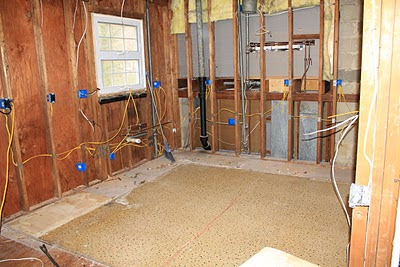
Until then, let's just take a little look-see at what we started with, shall we??
UGH UGLY so bad so bad.... 1970's bad. And so gross. Anyway... we tore that thing out. And then phase two looked like this...
Honestly this is better than picture one. A nice clean slate.
Last night, J was the best husband ever and skipped soccer (I know, big time) and worked on grouting the tiles and getting things back in place. I think we are both ready to say goodbye to this project for good and just enjoy our new space. Excuse the dark-ish blurry-ish pictures. Apparently my iphone and its camera were not wanting to cooperate last night. None the less...
TRUE LOVE.


The kitchen with the MOSTESS. This looks amazing. I could LIVE in that kitchen.
ReplyDelete